Want to build an engaging mobile app?
Updated 5 May 2023

Here’s the Ultimate Guide
We cannot overstate the importance of user interface design in the 21st century. Whether it is on their tablets, TV, desktops or mobile phones, the users of today expect frictionless design and don’t have patience for anything that’s a little less polished.
The user interfaces (UI) determines how the user will perceive the app and the likelihood of interacting with it again (the success of your app). A mobile app that gives users a great user experience makes the user desire to use it again, leave good reviews, give good ratings, and recommend it to potential users on social media platforms.
With millions of apps vying for user attention on Appstore and Playstore, competition is higher than ever and a developer is faced with the task of making their app seamless and their apps need foster customer delight at each touchpoint so as to stand out.
Here are some guidelines that can assist developers or mobile app development companies to create a more engaging user experience.
Minimize the effort and confusion of the user
Any mobile app development company or developer worth their salt must ensure that their app interface does not cause too much cognitive load to the user. If any user gets overwhelmed by too much information or finds it difficult to navigate you app, it means your user interface has failed. No matter how complex your apps function, you should be able to break it down into bite sized chunks that are easy to understand. Any additional effort that the interface requires from the user increases that chances of user drop off exponentially. They would rather use an app that is easier to navigate and use.
To make your app more engaging and reduce the bounce rate, you should ensure that it does not have too many options for the user to choose from, too many questions to be answered, and too much information to be read and understood. Too much of everything increases the user’s cognitive load and thus makes it unusable.
A few good thumb rules are using more graphics than text, making instructions simple and clear, and using familiar schemes are a few tips that you can employ to build a more engaging mobile app with less bounce rates and high conversion rates.
Keep clutter out (Keep content and elements to a minimum)
A cluttered interface immediately puts off a user upon launching an app. Clutter is worse on a mobile app as the screen size is small. Clutter overloads the user with too much information and further confuses the user.
Cluttering arises when you try to incorporate too many features at once. You should analyze those features of the app that are most crucial and put in more effort in making them engaging and intuitive. Any feature that is not absolutely necessary should be discarded. People prefer an app that does a few things well rather than apps that attempt to do everything in a shoddy manner.
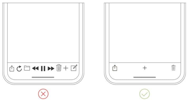
For you to build an engaging mobile app, you have to minimize complexity. The best way to do this is through the use of functional minimalism technique which involves keeping content and interface elements to a functional minimum, and using progressive disclosure for more options to prevent the problem of cluttered interfaces.
Minimize repetitive tasks
Doing the same thing over and over is boring. An app user will be bored by an interface that requires carrying out the same task several times. This happens in routine tasks such as form filling. You should not make users to re-enter data they have previously entered as it makes them easily annoyed. The users find data entry very tedious especially if they have provided the same information before.
Your app should be performing maximum work while requesting a minimum amount of information from the users. Use of defaults when filling forms speeds up the user interaction as they do not have to specify a value where the default is acceptable. Defaults provide an example of the expected input thus the user does not have to figure out on their own.
The app should implement the autofill functionality especially for search queries. A user does not have to re-enter the same data entered previously whenever they are searching for an item searched before. An app should be able to utilize all the data submitted by the user. The autofill feature should provide a visible button to allow the user to edit in case where the auto-filled word is not the intended one. Apps that do not autofill user data, in these recent times, are considered poor as far as user engagement is concerned.
Break down large tasks so they are manageable
Building a mobile app is not just about its appearance, but it also matters how users are consuming the displayed information. Developers should ensure that they break down long tasks into bits especially where users’ input is required. Failing to divide a long task into subtasks makes it difficult for the user to follow all the steps at once.
For example, during the checkout process, it is good to break the process into subtasks. Each subtask should consist of related tasks. For instance, one subtask to collect user personal data and the other task to collect payment details.

Breaking a long task into subtasks helps to establish a flow by connecting related tasks. For example, presenting the purchase button after browsing some products. Breaking the tasks down into subtasks with a clear visual indicator of progression gives user the right ‘gratification’ at the right intervals to ensure that the user completes the task without dropping off.
Minimize the learning curve
Effective mobile app UIs should reduce the user’s learning curve by focusing on learnability. Using familiar screens that users have interacted with, in other apps helps the user to learn quickly on how to interact with the app.
Screens such as ‘Getting started’ are not new in mobile apps and users do not require more explanations as they are already familiar with them.
For new users, an on-boarding screen or tutorials should be presented once they launch the app. The screen is meant to familiarize the user on how to use the app and utilize all features. The aim of onboarding is to demonstrate how the app will be useful to the user. It should be kept simple, effective and just enough, not too long or short.
Functional animations, gamification, and graphics can be used to help the user with interacting with the app. Gamified tutorials with characters can be used to guide the user through a series of steps for them to accomplish various tasks on the app.
However it is essential that you make sure that your app loads and renders content quickly as loading times with lead to drop offs. You can lower the loading time by minimizing http requests and redirects, and loading just enough content that the user needs when a page loads.
Prioritize element size according to importance
Large elements are easily identified and appear more important than the smaller ones. You should ensure that the most important elements on the screen have the biggest sizes and the sizes of the others decrease with importance. The smallest features in size should be visible and big enough for touch if need be.
The most important element on the interface should be given the most visual weight. You can do this by adjusting the weight of weight, color, and the size of the font.
Different element sizes and color density helps the users to quickly distinguish primary tasks from secondary tasks. Also, you add highlights to the most important buttons to help users identify those that are primary and the secondary ones.
No jargon or buzzwords, use a conversational tone
The language used in the app is important in engaging a user, therefore should not alienate target user. Technical jargon, acronyms, flowery language can confuse the user as it increases their cognitive load. You should understand which words and phrases are familiar and understandable to the target audience.
For an app to appeal to most people, it should steer clear of technical language. You should avoid buzzwords, acronyms, and pretentious-sounding words. You should understand the user and avoid making assumptions on what they know or understand. Stick to a high school reading level to make sure that you app is accessible to everyone.
Ensure consistency in design language
Design consistency helps in eliminating user confusion. Features such as buttons, images, colors, and interface design should be the same throughout the app. Changing the balance of uniformity disorients the user, thus an overall consistent appearance should be maintained all through.
The buttons, label and typeface should be consistent all through the app so as to ensure there is visual uniformity. Functional consistency should be maintained by having the interactive features work similarly in throughout the app. External consistency involves having a consistent design for the same app across different products. The users will be familiar with the app even when using a different product.
If you are a developer or a mobile app development company, follow these guidelines to ensure that the visual language of your app is consistent.
Follow the guidelines of the mobile app development platform
Different platforms have different interaction patterns which arise from following the guidelines of the platform in use. If these guidelines are not followed, the interactions patterns change and this confuses the user.
The user interface elements, such as icons, checkboxes, and typefaces, used on one mobile app development platform may not work on another platform. Components native to a platform makes users resonate with them and trust the app.

Build as per platform style guides (Android and iOS)
Each mobile app development platform has its specific guidelines for interface design. When the guidelines are followed to the letter, the quality of the resulting interface will be high. You are encouraged to try out new innovations with the touch gestures and navigation systems to be able to create user interfaces that are improved. This helps you to discover the features that are vital to your app and those that are not.
A top mobile app development company should ensure that all the developed mobile apps adhere to the respective platform standards. For example, iOS has Apple’s Human Interface Guidelines and Android has Google’s Material Design Guidelines. Adhering to the set guidelines ensures consistency. Each mobile OS creates a specific experience for its users. Therefore, complying with these guidelines will ensure that there is no friction and the user’s experience is maintained.
The mobile app should be consistent with the website
The color schemes, images, language and icons used in the app and the mobile app should be the same so that a customer may not feel lost when switching from one platform to the other. This also helps build trust amongst the user and helps them identify your digital properties accurately at a glance.
Make sure you design for everyone
Users, regardless of age, gender, origin, and level of education, should be able to use your app successfully. The key element on the screen should have the most visual weight. Addition of weight to an element is possible with size, color and font-weight.
You should also use clear communication. Use a language you know your target audience will understand. Unknown terms will only increase the cognitive load for the audience. Additionally, maintain a consistent appearance throughout your app. Buttons, visual consistency typefaces, as well as labels, should be consistent. Functional interactive elements should also work simultaneously in the entire parts of your mobile app.
Avoid mimicking UI elements from other avenues. As you create your app for iOS or Android, don't bring over UI elements from other platforms. Use native components as much as you can to win over people's trust.
Keeping interactive elements familiar and predictable is a vital aspect for a good app. Unlike the case on desktops where users can use hover effects to comprehend whether something is interactive or not, on mobile phones users check interactions only through tapping on an element.
Animations are good but don’t overdo it (KISS Keep it Simple Stupid)
Animations make an essential part in developing mobile apps as they enhance usability. They bring the app’s UI to life and makes it intuitive and responsive. Animations reduce the user’s cognitive load as they are used to convey a message that would have otherwise be communicated in words.
Animations enhance user experience only when used at the right time and place. You should ensure that the animations are meaningful, have a purpose and are functional. The animations play several roles on the UI such as providing visual feedback for user actions, providing visual gratification, and showing navigation transaction, among others.
Overuse of animations ruins the user experience because it overcrowds the small mobile screen. Good animations, when overused becomes annoying. You should ensure that animations are only used when necessary and are not too many on one screen.
Use intuitive navigation
Good navigation gives a user a good experience. Your app could have the best feature and compelling contents, but if the user cannot or is having trouble to access them, they are just useless. You will lose the users. A user should be able to figure out where they would like to visit and how to get there with ease.
For navigation to be smooth, it should be integrated into the app structure so that it does not draw the focus away from the content. Good navigation informs the users of their current location.
If you are a developer or mobile app development firm that prioritizes the ease of use for customers, then you should ensure that your prioritize the content on a screen to ensure the user finds whatever they are looking for with minimal scrolling. Scrolling side-ways is considered a poor design, scrolling should ideally be up and down only.
The number of steps required to complete a task should be minimal. Too many steps, also known as deep navigation, dents the user experience. A user will grow impatient and may not be willing to navigate more than three levels below the home screen.
Consistent navigation controls helps the user not to become confused or disoriented.
Don't invade privacy, ask only permissions you need
Some apps need the user to register first in order to avail customized experience and boost conversions. However, top mobile development companies and developers know that this is a step that needs a very careful approach. The User Interface at this step is the bridge between an ‘active user’ and a ‘drop off’.
Don't force a user to provide personal information upon opening the app and it will lead to distraction and discomfort. Most app users fear that sharing their email might result to a series of marketing emails. It is therefore a good idea to allow your user take a tour and see the app for a while then later remind them to sign in after that.
Also, don't ask for information you're not allowed to acquire from the user. Always ensure you only ask for the required personal information.
Ensure your app is responsive
Always ensure your app is responsive and well rendered on mobile. To ensure this, work on following areas.
Layout
When building a responsive mobile app, the first thing you ought to look out for is the layout. Ensure the layout design is simple and doesn't take a lot of time loading and displaying information or graphics.
Media Placement
This is a very important aspect of a modern application. Media such as images or videos should never be bigger than their parent container. It is a simple thumb rule but works magic for the appeal of a mobile app.
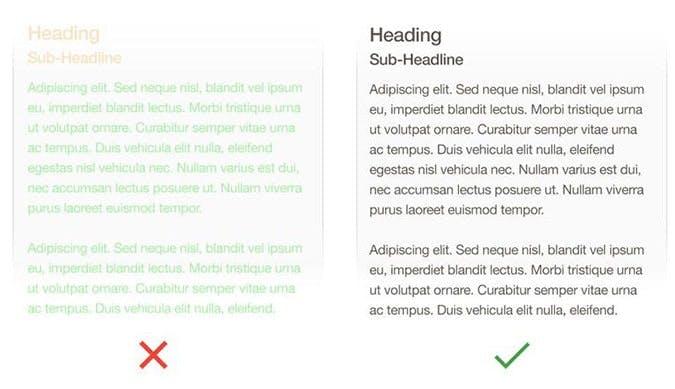
Content should be readable and legible
The reason why users access websites or apps is to access the content. Content is presented in form of fonts and texts. Every mobile app developer has the responsibility of making the text legible.
One usability requires that developers should choose a typeface that is compatible with different sizes to enhance readability.
For example, Apple utilizes the San Francisco family of typefaces while Android uses Roboto and Noto to avail a consistent reading experience.
You should ensure that the font size used is legible. Typically, a minimum font size of 11 is encouraged. A small font size causes leaders to strain while reading your content.
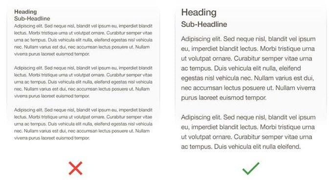
You should also ensure that the used color contrast for text is sufficient to prevent the text blending with the background.
Use High-quality images
One strategy that a mobile app developer can use to enhance an apps appeal is using high resolution images and graphics. The images should have vibrant colors, clear and an attractive background.
However, developers and mobile app development companies should balance between beauty and functionality. Developers should also avoid using too many colors. Using high-resolution images ensures that the images do not blur when zoomed.
The developers should realize that very high-resolution images are heavy, tend to load slowly and consume a lot of bandwidth. Therefore, the app developers should strike a balance between performance and image quality.
Keep testing and implementing feedback
Continuous app testing is crucial in fixing identified bugs and vulnerabilities. Use of customer feedback is one strategy that mobile and web development companies use to enhance their applications.
Customers provide genuine feedback because they have actually used the application. Constant interaction with the app makes customers a crucial stakeholder in the app development process. Aligning an app with the customer’s requirements positively impacts the user’s experience which leads to more downloads and consequent high returns.
Hire an app development company that does it all for you
If you are a business owner looking to develop your own mobile app, it can be a nightmare to hire a team of Full stack Developers, UX designers, Testers and Project managers to make sure that your app interface is functional and beautiful. The development costs can get prohibitive and the tech talent is notoriously hard to find and retain.
It’s much more efficient to pick the best mobile app development company that has all of these talents and skill sets in house.
If you’re looking for a team that develops websites and mobile apps that are centered on strong UX principles, then Intuz is the firm you’ve been looking for. They have a team of 8+ creative UX designers that underpin every app project with their ‘Human centered design’ approach, they work in tandem with our frontend and backend teams to ensure that UX principles are always adhered to even during the most fast paced product life cycles.
Intuz is a San Jose based Mobile App Development Company established in 2008. They are a prolific team of app developers with over 1500+ successful app launches under their belt. They have a 5 star rating on popular review platform Appfutura and a 4.6 star rating on the international vendor review site Clutch.
They are well reputed for their excellent work in crafting award winning digital products. They have worked with premier clients across industries including AMG Mercedes (Automotive), JLL (Real Estate), Holiday Inn (Hospitality), SGC (Supply Chain), Pocket Money (Fintech) amongst many others.
Explore our Mobile Development Resources & Insights
Intuz has a team of experts that can take care of your Mobile App Development process and requirement.


Trusted by
WORK WITH US
Tell us what
cant'fail
We respond within 24 hours with a clear point of view, not a sales pitch.
GET IN TOUCH
or email getstarted@intuz.comResponse within 24 hours — no junior reps
NDA on every engagement — standard, not optional
GDPR · HIPAA · DPA — compliance frameworks are standard, not custom-added
No retainers. No lock-in. Your IP, always.