A Guide On The Best Data Visualization Tools For IoT Applications

There are many fantastic data visualization tools that can be used in IoT applications — from Grafana and Tableau to IBM Watson to Power BI and Kibana. This guide dissects the need for visualization tools and the best options available in the market.

Image
Published 13 Dec 2021Updated 18 Mar 2023

Table Of Contents

  • 2022 and beyond: Stepping into a data-driven era
    • How data visualization affects an IoT project
      • IoT data visualization tools are helpful in meeting a number of goals in creating an open-source IoT platform:
        • 1. Streamline millions of data sets in one place
          • 2. Unlock multiple insightful values
            • 3.  Create an agile working environment
              • 4. Deal better with crucial industries
              • Data visualizations across sectors
                • 1. Transportation
                  • 2. Logistics
                    • 3. Public sector
                      • 4. Environment
                        • 5. Agriculture
                            • 6. Healthcare
                              • 7. Retail
                              • Challenges in IoT data visualization
                                • 1. Data oversimplification
                                  • 2. Hampered data quality
                                    • 3. Limited algorithm interpretation
                                      • 4. Skill gap
                                        • 5. Edge computing
                                        • Top 16 data visualization tools for IoT apps
                                          • 1. Power BI
                                            • Unique features of Power BI include:
                                              • Cons of using Power BI:
                                              • 2. Grafana
                                                • Prominent features of Grafana include:
                                                  • Cons of using Grafana:
                                                  • 3. Kibana
                                                    • With Kibana, you can avail the following features:
                                                      • Cons of using Kibana:
                                                      • 4. Tableau
                                                        • Main features of Tableau include:
                                                          • Cons of using Tableau:
                                                          • 5. Thingsboard 
                                                            • Unique features of Thingsboard are:
                                                              • Cons of using Thingsboard:
                                                              • 6. IBM Watson
                                                                •  Salient features of IBM Watson include:
                                                                  • Cons of using IBM Watson include:
                                                                  • 7. Domo
                                                                    • Incredible features of Domo:
                                                                      • Cons of using Domo include:
                                                                      • 8. Freeboard 
                                                                        • Freeboard has a variety of features, such as:
                                                                          • Cons of using Freeboard include:
                                                                          • 9. Looker
                                                                            • Key features of Looker:
                                                                            • Cons of using Looker include:
                                                                              • 10. Zoho Analytics
                                                                                • Amazing features of Zoho Analytics:
                                                                                • 11. Sisense
                                                                                  • 360-degree features of Sisense:
                                                                                  • Cons of using Sisense include:
                                                                                    • 12. Databox
                                                                                      • Salient features of Databox:
                                                                                        • Cons of using Databox:
                                                                                        • 13. Visme
                                                                                          • Key features of Visme:
                                                                                            • Cons of using Visme:
                                                                                            • 14. Google Charts
                                                                                              • Tremendous Features of Google Charts
                                                                                              • 15. Datawrapper
                                                                                                • Key features of Datawrapper:
                                                                                                • Cons of using Datawrapper:
                                                                                                  • 16. SAP Analytics Cloud
                                                                                                    • SAP Analytics Cloud offers the following features:
                                                                                                      • Cons of using SAP Analytics Cloud:
                                                                                                        • How to choose the right visualization tool 
                                                                                                        • 1. Decoding digital information 
                                                                                                          • 2. Ensuring accuracy
                                                                                                            •  3. Saving time
                                                                                                            • Tips to follow to make the right choice
                                                                                                              • 1. Proficiency to display exploratory graphics
                                                                                                                • 2. Draw your desired visualization first
                                                                                                                  • 3. Data visualization should follow function
                                                                                                                    • 4. Maximize clarity, minus visual overload
                                                                                                                      • 5. Choose a tool suitable for your audience
                                                                                                                        • 6. Calculate the intuitiveness
                                                                                                                          • 7. Efficiency to summarize all the information
                                                                                                                            • 8. Intermingle multiple data sources and factors
                                                                                                                              •  9. Compare functionality vs. needs
                                                                                                                                • 10. Consider your team’s expertise
                                                                                                                                  • 11. Identify the scope of features
                                                                                                                                    • 12. Select a tool as per your industry

                                                                                                                                    Data is everywhere. Right from when consumers visit a company website to the moment they sign out, their browsing pattern is tracked including the CTA they clicked, pages they visited, sections where they spent most of the time, and so on.

                                                                                                                                    In the world of Internet of Things (IoT), the data received from wearable devices that monitor your heartbeat to the logistics company that uses smart contracts and also a smart city for asset tracking — every device, sensor, network and sensor contribute to Big Data.

                                                                                                                                    But do you know what? All this data is useless if it does not serve a purpose or adds value to a specific business function. No remote device control can help in this case!

                                                                                                                                    You see, in this digital day and age, data is meant to be analyzed to make operational improvements and drive superior user experience in general.

                                                                                                                                    But when you have a wealth of information to process and analyze, it can get pretty overwhelming even for the most experienced of teams. You have to deploy certain tool supports or techniques to simplify the job. There are no two ways about it!

                                                                                                                                    2022 and beyond: Stepping into a data-driven era

                                                                                                                                    An average human brain is wired to properly consume imagery compared to words or numbers. Ever heard of the saying, “a picture is worth a thousand words?” When you put data in a visual format, it is much easier to make sense of it. 

                                                                                                                                    That is where using smart tools help slice the data to its most granular level. But before we head on to explore the tools, let us understand the meaning of data visualization. 

                                                                                                                                    In simple words, it is basically a technique that enables you to present the raw data, picked up from various sources of data, insightfully. It looks for certain patterns and behaviors and displays them in a way that helps create a viable business strategy.

                                                                                                                                    This could be in the form of real-time graphs, pie charts, column bars, and so on. A data visualization tool collates and understands the massive amount of info — from various data sources — emanating from multiple sensors and showcases the same in a visual summary.

                                                                                                                                    It helps manipulate data based on the customization of every data set as per a specific business objective. That means every number gets a meaning attached to it.

                                                                                                                                    How data visualization affects an IoT project

                                                                                                                                    It is clear that the terminology has many advantages in the business world. But how can it be used to improve IoT solutions? That is an important question to ask.

                                                                                                                                    When a number of hardware and software platforms exchange IoT data every millisecond, it leads to a need for data visualization. As the IoT landscape is expanding at a rapid pace, it is only natural to incorporate techniques that can get businesses to have a better hold on their data when it comes to various IoT devices.

                                                                                                                                    IoT data visualization tools are helpful in meeting a number of goals in creating an open-source IoT platform:

                                                                                                                                    How IoT data visualization tool helps to achieve the goals 

                                                                                                                                    1. Streamline millions of data sets in one place

                                                                                                                                    An IoT dashboard comprises multiple widgets that visualize data in the form of line graphs, bar charts, gauges, heat maps, geographical screenshots from IoT data transmitted across multiple IoT devices over a period. When the data is collected on a single dashboard in different forms, it helps business owners make better sense of their IoT product and also gain a meaningful insight.

                                                                                                                                    2. Unlock multiple insightful values

                                                                                                                                    You can make real-time decisions after merging multiple data sources on a single dashboard coupled with multi-layered visual data. This consumable information also helps monitor IoT infrastructure and devices for efficient data flow, and enables the analysis of multiple data correlations in real-time.

                                                                                                                                    3.  Create an agile working environment

                                                                                                                                    When the data is translated into compelling visualizations, it helps employees become more collaborative and dynamic while creating high-end user experiences. There is more clarity about the data they are dealing with and they can make better decisions.

                                                                                                                                    On the other hand, the data from various sensors can be used to deliver insights in a contextualized manner. It allows employers to detect data anomalies, access system access and offer effective guidance to employees. That is how IoT data visualization tools help.

                                                                                                                                    4. Deal better with crucial industries

                                                                                                                                    As IoT systems are capable of real-time data processing, visualization methods give users an opportunity to increase their efficiency. This is especially helpful in critical sectors such as manufacturing and healthcare where timeliness of a delivery and the wellness of human life respectively are at risk.

                                                                                                                                    Data visualizations across sectors

                                                                                                                                    Every business wants to monitor key performance indicators in real-time to get a better idea about how well they are performing or how quickly they are achieving their objectives. For the same, they turn to specific visualization tools for translating data into understandable format.

                                                                                                                                    From graph configuration and dashboard creation to geospatial imagery and data analysis — there are many related techniques that come into play across operating systems.

                                                                                                                                    Given how the need for interactive visualization has grown in the last few years, it is not surprising to know that its software market is set to grow at a CAGR of 9.69% until 2026. You will agree this technique offers a ton of advantages to all sectors and their corresponding businesses.

                                                                                                                                    Irrespective of the software used, every tool is centered on supplying dashboards that help keep tabs on crucial information for businesses, and understand all the data with less difficulty. Obviously, this concept transcends all industries.

                                                                                                                                    There are many sectors that have gained the most benefits from BI tools. Let us check out the most important ones:
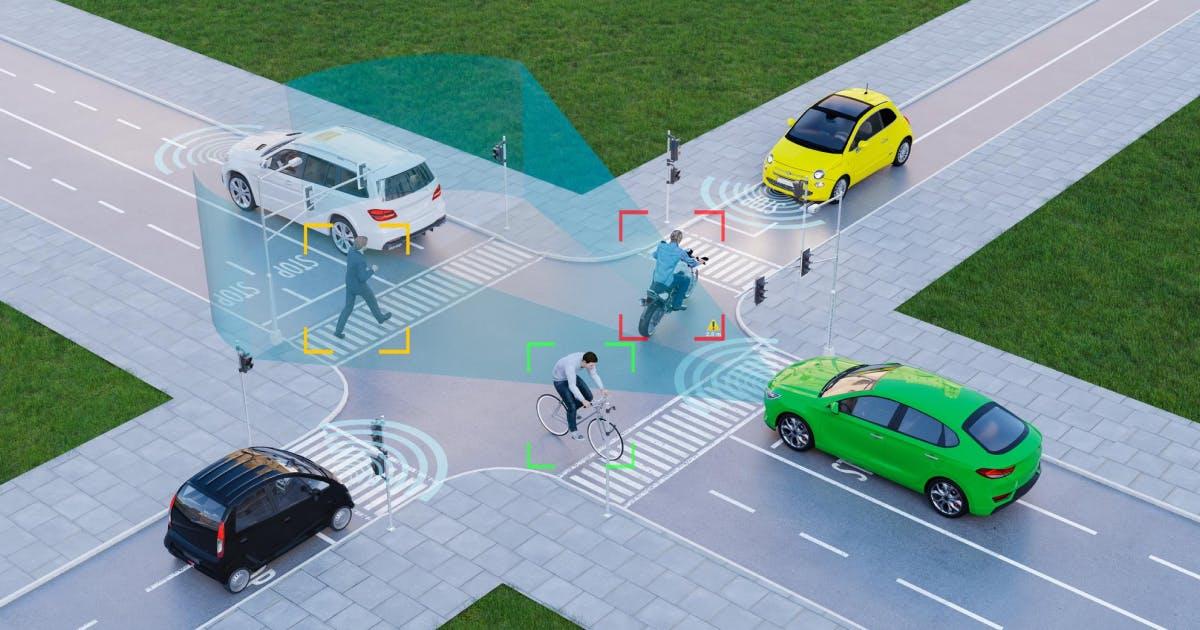
                                                                                                                                    Data visualization across sectors

                                                                                                                                    1. Transportation

                                                                                                                                    Do you know what is the most taxing job in the sector? Routing transportation networks. And that has its own set of overwhelming challenges. Modern cities cannot survive without planning public transport. All hell will break loose if that does not function properly.

                                                                                                                                    That is why freeways need to be constantly monitored and optimized for preventing accidents and roadblocks. These BI tools help city traffic police identify patterns and trends easily especially when it comes to data clusters.

                                                                                                                                    The detailed analysis reports from geographic information systems is analyzed for making suitable choices in setting up urban areas that cover parks, grounds and parking spaces.

                                                                                                                                    2. Logistics

                                                                                                                                    Businesses that mainly rely on vehicular fleets turn to the concept, coupled with prompt information and engaging maps, for making servicing a breeze. These components are incorporated with elements such as video tracking and data workload solutions, and can also be accessed via a mobile app.

                                                                                                                                    On the other hand, hub visualization for sea-based amenities using bathymetry data and cargo operations which require sensor tracking can also do wonders with data visualisation methods.

                                                                                                                                    3. Public sector

                                                                                                                                    Businesses and professionals in this industry make use of data visualization techniques to display data links that can help in identifying criminal offences such as fraud. The same can be analyzed through the use of a simple, rule-based question-answer format for data storytelling.

                                                                                                                                    From text mining methods and anomaly detection to pattern identification, businesses can detect fraud, abuse and wastage as they reduce the future fraud risk.

                                                                                                                                    Empowered with complete financial visibility, leaders can enhance transparency, reduce inappropriate transactions, heighten accountability, and guarantee program productivity.

                                                                                                                                    4. Environment

                                                                                                                                    Geographic information systems and maps form the backbone of risk reduction strategies and action-oriented schemes of almost all environmental ventures and public service companies that seek sustainability.

                                                                                                                                    In fact, pattern identification is a huge problem for present-day ecological professionals. This can be rectified with interactive initiatives, highlighting the root cause of ecological phenomena via micro and macro view of data visuals — even on the mobile app.

                                                                                                                                    Moreover, environmental consultants can deploy visual formats for harnessing information from sensors and creating a stable solution for their projects.

                                                                                                                                    5. Agriculture

                                                                                                                                    Although still seen as an archaic profession, farming has made great strides in the past couple of years thanks to the advent of AI and Blockchain. Both technologies have enabled farmers to keep track of the state of their crops  using smart contracts and sensors.

                                                                                                                                    They can use data visualization tools to monitor their lands, insure their crops and claim damages with insurance companies, provided the situation arises.

                                                                                                                                    A Guide On Top 14 IoT Programming Languages

                                                                                                                                    Learn More

                                                                                                                                    6. Healthcare

                                                                                                                                    Ever since Coronavirus entered the picture, the healthcare sector has been under immense pressure to manage the crisis and prevent health risks from growing any further.

                                                                                                                                    In a normal scenario, such tools help save lives and enable medical professionals to oversee urban activities amidst quarantine, track healthcare facilities, analyze demographics for medical research, map virus spread, and examine the accessibility of pharmacies.

                                                                                                                                    Data visualization tools can help provide public health officials all the support they need to supply the hospitals and clinics with healthcare staff, equipment and medicines on a regular basis so that they can effectively help patients in need and save lives.

                                                                                                                                    Data visualization helps easily keep track of the COVID situation — determining risk areas and help center locations — in IoT applications.

                                                                                                                                    For instance, businesses can discover how the pandemic will affect their social landscape and daily operations through smart maps displaying the latest information on Coronavirus. That way, help can be provided in high-risk locations without wasting a lot of time.

                                                                                                                                     If we remove COVID from the picture, then also data visualization tools have a huge part to play in healthcare. It helps analyze the accessibility of a particular region, helping public health officials and medical professionals to ensure everyone receives the right treatment without any delays.

                                                                                                                                    7. Retail

                                                                                                                                    This sector has seen many lows ever since the pandemic began, which means retailers need all the help they can receive to operate as efficiently as possible.

                                                                                                                                    Thanks to interactive visualizations, they can address new growth challenges, reduce operational costs, optimize their supply chain and maximize performance expenses using a stellar user interface.

                                                                                                                                    Retailers can also conduct demographic analysis based on income datasets to uncover the most inhabited areas that are good for growing the business.

                                                                                                                                    Challenges in IoT data visualization

                                                                                                                                    As we move steadily towards the information age, it would not be surprising to see a rise in the product demand and skyrocketing disposable incomes. In fact, that is already happening.

                                                                                                                                    No wonder many industries are leveraging the power of data for boosting efficiency and improving customer service. But IoT analysis comes with its own set of challenges.

                                                                                                                                    For starters, the data generated by sensors or sensor-enabled tools is different from the transactional data found at the core of many organizations.

                                                                                                                                    In such a scenario, data management is less structured and requires an advanced set of tools for effective analysis. But before we touch upon the solutions, let us first study the challenges that come in IoT data visualization:

                                                                                                                                    Challenges in IoT data visualization

                                                                                                                                    1. Data oversimplification

                                                                                                                                    It is true that data visualization tools uncomplicate heavy datasets through easy-to-understand visual representations. However, the simplification of data can often go sideways. 

                                                                                                                                    Meaning, the pictorial representations may miss out on certain key aspects that could entirely change the dataset’s interpretation. Therefore, it is necessary to take help from an IoT expert who ensures this does not happen.

                                                                                                                                    2. Hampered data quality

                                                                                                                                    The quality of data visualization influences the data quality, which may also get hampered depending upon how it is entered into the system, categorized or managed.

                                                                                                                                    Key elements responsible for maintaining the quality are data completeness, consistency, accuracy and relevance across factors like accessibility, reliability, sources and appropriateness. To alleviate the pain point, it is therefore necessary to do a regular check of data sources.

                                                                                                                                    3. Limited algorithm interpretation

                                                                                                                                    The algorithms used in converting data into visuals are ultimately based on human inputs, which does not help the case. That is because human beings are fundamentally flawed and so their input can alter the visual output.

                                                                                                                                    For instance, certain data pieces highlighted in a visual representation might not be of no relevance at all, while the ones which were actually important might be ignored.

                                                                                                                                    The decision-making gives a very one-sided overview of the data. The use of proper visualization tools can curb this issue to a great extent.

                                                                                                                                    4. Skill gap

                                                                                                                                    IoT application development is an ever-evolving field. Therefore, it is crucial to have a team that has plentiful knowledge about the platforms that help produce visuals.

                                                                                                                                    Due to the lack of formal training, most data analysts rely on platforms with limited visualization capabilities such as spreadsheets, STATA or SPSS. Thus, proper training is necessary.

                                                                                                                                    5. Edge computing

                                                                                                                                    As IoT devices, sensors, servers and systems are spread across geographies, the network has given rise to a concept called edge computing. According to IDC, 40% of the IoT data will be processed via Edge by 2022. Since large IoT deployments are going to become mainstream, businesses will need to look at different ways to efficiently visualize data. That is why you need data visualization tools.

                                                                                                                                    Top 16 data visualization tools for IoT apps

                                                                                                                                    1. Power BI

                                                                                                                                    Power BI

                                                                                                                                    This real-time data visualization tool is used to create dashboards that present information in the form of graphics to improve business decision-making. It is an Office 365 service by Microsoft that can be used to connect datasets and/or models created in Excel 2013+ with powerful visuals.

                                                                                                                                    These visuals are grouped into dashboards and are designed specifically for interactive exploration on different devices, such as tablet computers, smartphones, or PCs.

                                                                                                                                    Unique features of Power BI include:

                                                                                                                                    • Automatic data refresh
                                                                                                                                    • Visualizations of real-time data
                                                                                                                                    • Support for IoT-enabled and connected devices
                                                                                                                                    • Support for both data types — streaming and static
                                                                                                                                    • Efficient handling of natural language data queries

                                                                                                                                    Cons of using Power BI:

                                                                                                                                    • Data connections are limited to on-premise Data Sets and Data Models.
                                                                                                                                    • Data refresh is limited to once per day.
                                                                                                                                    • It does not support ETL (Extract Transform Load) processes as they are complex.
                                                                                                                                    • It can only visualize data that resides in MS SQL Server, Oracle Database, IBM DB2, MySQL databases or Data Lake Store (Azure Blob Storage).

                                                                                                                                    Power BI helps streamline data publication and distribution. It updates in real-time and integrates dashboards of all popular services to uncomplicate your organizational setup.

                                                                                                                                    2. Grafana

                                                                                                                                    Grafana

                                                                                                                                    It is primarily used for metrics visualization and is a comprehensive Google analytics and visualization software that seamlessly integrates with Elasticsearch, MySQL, PostgreSQL, and many other databases. It allows you to raise queries, visualize information, and receive alert on your metrics no matter where they are stored.

                                                                                                                                    The open-source tool is useful for creating great-looking dashboards and histograms. Metrics visualization through Grafana allows you to analyze data in a better way, which can help you make informed decisions.

                                                                                                                                    Its intuitive dashboard can be customized in many ways. By using plugins, users can connect Grafana with over 50 data sources.

                                                                                                                                    Prominent features of Grafana include:

                                                                                                                                    • Provides time-series analytics to monitor changes in your database over an extended period of time
                                                                                                                                    • Allows you to make important decisions based on real-time information has customizable alerts set up, so if something goes wrong, it will notify you immediately using the preferred communication platform
                                                                                                                                    • Offers on-premise storage as well as integrates with any cloud platform of your choice, which gives complete control over the infrastructure

                                                                                                                                    Cons of using Grafana:

                                                                                                                                    • It has limited customization capabilities and does not provide many options in terms of visualization types or map features in the free version.
                                                                                                                                    • It is not capable of adding high-quality graphics to your site due to free usage limitations.
                                                                                                                                    • It lacks individual dashboard embedding abilities.
                                                                                                                                    • It does not facilitate embedding dashboards on websites.

                                                                                                                                    Grafana is useful for creating dashboards to display graphs and charts in real-time. It is ideal for internal usage and helps you visualize mixed or large datasets.

                                                                                                                                    3. Kibana

                                                                                                                                    Kibana

                                                                                                                                    It is used for logs visualization, and is an open-source browser-based visualization tool that allows users to visualize and analyze various data, which can be collected by Elasticsearch. You can use Kibana to create custom visualizations such as line graphs, bar graphs, pie charts, and heatmaps.

                                                                                                                                    It has a simple-to-use interface that is convenient for sharing amongst teams as well as with colleagues. Individuals with little technical knowledge can also use it easily.

                                                                                                                                    Kibana is open-source and free to use. It can perform fuzzy matches, which help in analyzing datasets with machine-learning techniques, such as anomaly detection.

                                                                                                                                    With Kibana, you can avail the following features:

                                                                                                                                    • Powerful visualization based on log data
                                                                                                                                    • The Discover tab on the interface allows users to explore logs stored within their public repositories using search keywords.
                                                                                                                                    • Data from multiple sources can be integrated into the same dashboard.
                                                                                                                                    • Allows fuzzy matching of data queries, which means you do not have to provide an exact match when searching through your time series data
                                                                                                                                    • Easy to set up with automatic sharing capabilities without the need to install any additional software

                                                                                                                                    Cons of using Kibana:

                                                                                                                                    • It is not highly effective in handling large datasets which impacts its performance.
                                                                                                                                    • Upgrading Kibana to a newer version is a tiresome process.
                                                                                                                                    • In case of version mismatch, adding plugins to the tool is a lengthy process.

                                                                                                                                    With Kibana, you can search for hidden insights in your data set and use visualizations, such as charts or maps, to optimally utilize data stored in your database.

                                                                                                                                    4. Tableau

                                                                                                                                    Table AU

                                                                                                                                    It is a powerful data visualization software enriched with advanced analytical and user interaction capabilities. You can create various charts with interactive features, for use by both beginners and experts alike.

                                                                                                                                    With the in-depth analyses provided by the R scripting language, you have even greater visualization powers. Tableau is available in several variants, including desktop app, server, and hosted online versions, and it is used in several industries globally.

                                                                                                                                    The tool offers data import possibilities across platforms, you can upload data using CSV files, Google Analytics data, or even Salesforce data.

                                                                                                                                    Main features of Tableau include:

                                                                                                                                    • It is flexible in its visualizations, with many options for graphs, including pie charts, bar graphs, line plots, etc.
                                                                                                                                    • The data analysis software is quick and easy to use. It helps you turn your ideas into clear visualizations.
                                                                                                                                    • There are numerous data import options and they are customizable too.
                                                                                                                                    • Lots of video tutorials are available to walk you through everything from how Tableau works to using filters or changing views in order to analyze huge sets of information across industries.

                                                                                                                                    Cons of using Tableau:

                                                                                                                                    • The non-free version of Tableau is expensive.
                                                                                                                                    • Its public version also limits how much data can be kept private.
                                                                                                                                    • Its online service has limited storage space for publicly available information, but it does support most formats used to store or display all types of different data sets.

                                                                                                                                    Tableau offers many different ways for users of all skill levels to visualize data in various forms and gives them interactivity options. This makes it perfect for those businesses that are interested in a deeper analysis.

                                                                                                                                    5. Thingsboard 

                                                                                                                                    Thingsboard

                                                                                                                                    It is a revolutionary open-source platform that makes it easy to build interactive IoT dashboards. Thingsboard follows industry-standard protocols for device connectivity such as MQTT, CoAP, or HTTP. With this tool, you can visualize data collected by multiple sensors and devices at once on custom-made online maps or charts.

                                                                                                                                    Thingsboard has features like line graphs for historical visualizations as well as bar charts, which are perfect for real-time data analytics.

                                                                                                                                    The software's complex stack technology ensures seamless performance while its error-free data analytics provide real-time insights into your device usage patterns.

                                                                                                                                    The tool also has map widgets to track the location of objects through Google Maps and capture data of events in their surroundings.

                                                                                                                                    Unique features of Thingsboard are:

                                                                                                                                    • Offers a number of templates and projects for inspiration and fast deployment
                                                                                                                                    • Allows development of custom applications through its integration APIs and uses their own data visualization tools
                                                                                                                                    • The tool is mobile-friendly and offers multi-platform support.
                                                                                                                                    • Available for installation — either on-premises or as a cloud solution
                                                                                                                                    • Supports both SQL and NoSQL databases
                                                                                                                                    • Provides device management, sensor data collection, and user roles and permissions management

                                                                                                                                    Cons of using Thingsboard:

                                                                                                                                    • Most of the Platform Integrations are in PE version i.e. Azure, IBM Watson, and AWS IoT.
                                                                                                                                    • The community is very small; hence limited support.
                                                                                                                                    • A lot of features of the tool are still under development mode.

                                                                                                                                    Thingsboard is a powerful IoT monitoring and control platform that allows you to set up complex dashboards quickly.

                                                                                                                                    6. IBM Watson

                                                                                                                                    It is an IoT-based cloud platform offered as a service by IBM. It supports several programming languages, services, and integrated DevOps to deploy and manage your applications on the cloud. The PAS utilizes big data in a variety of ways to provide information and insights that help decision-makers improve IoT performance.

                                                                                                                                     IBM Watson offers developers the tools needed for collecting, storing, and analyzing unstructured big data from different sources. The tool helps you get more value from your AI infrastructure by automating processes and optimizing employee productivity.

                                                                                                                                     Salient features of IBM Watson include:

                                                                                                                                    • IBM Watson is a suite of advanced graphical and UI-based tools.
                                                                                                                                    • You can use it for API development, data science notebooks, and GitHub integration.
                                                                                                                                    • Image analysis helps you gain insights from images.
                                                                                                                                    • Image Identification uses deep learning algorithms to recognize objects or concepts within images.
                                                                                                                                    • You get access to the IBM Data Refinery through an interactive UI to enable collaborative data analysis and visualization.

                                                                                                                                    Cons of using IBM Watson include:

                                                                                                                                    • Loading time is usually slow and navigating the dashboard tabs is not easy.
                                                                                                                                    • The learning curve gets steeper than expected as adequate user guidance or reference examples are not available. It is not for amateur data analysts.
                                                                                                                                    • You may not be able to integrate it easily with your existing Hadoop systems.
                                                                                                                                    • Streaming data visualization support is not available.

                                                                                                                                    IBM Watson is designed to connect enterprise systems, sensors, devices, and cloud applications across future-looking enterprises. The supercomputer utilizes its vast domain knowledge to make quick decisions across a wide variety of businesses from different industries.

                                                                                                                                    Industrial IoT vs. Consumer IoT: Everything You Should Know About

                                                                                                                                    Learn More

                                                                                                                                    7. Domo

                                                                                                                                    It is a cloud-based business analytic tool that allows users to query, analyze and visualize data from numerous sources. Users can query any data source connected to Domo by using the company's intuitive interface.

                                                                                                                                    Once you are logged into the system, you simply have to "drag" your fields onto the gray canvas. You can then decide whether to display charts in tables or maps as well as export/share them via social media or email.

                                                                                                                                    More importantly, users who do not have advanced analytics experience can still benefit from Domo, since all of their findings and knowledge will be recorded in a centralized repository due to its artificial intelligence feature.

                                                                                                                                    Incredible features of Domo:

                                                                                                                                    • Provides multiple data visualization tools for creating simple to complex dashboards
                                                                                                                                    • It gives you the power of storytelling through an intuitive dashboard.
                                                                                                                                    • Allows you to transform data from any system
                                                                                                                                    • Easy to use for those who do not know how to code or use a command-line interface
                                                                                                                                    • Its drag-and-drop ETL allows you to easily transform live data into meaningful reports
                                                                                                                                    • Equipped with over 1,000 pre-built connectors — it helps in setting up connections between different sources that are flexible enough for any situation.

                                                                                                                                    Cons of using Domo include:

                                                                                                                                    • It is not very efficient when processing large datasets.
                                                                                                                                    • Limited functionality of the pivot table is available.
                                                                                                                                    • Deploying it on-premise is very expensive.
                                                                                                                                    • The speed of upgrades and changes is slow.

                                                                                                                                    Domo helps eliminate any lag time between departments and improves the efficiency of your company while collecting inputs across teams.

                                                                                                                                    8. Freeboard 

                                                                                                                                    freeboard

                                                                                                                                    It is a free, open-source platform for creating and sharing dashboards. The dashboard can be personalized with widgets to monitor anything from social media stats to electric grid activity on a map. You can view the data city-wise or country-wise on Freeboard.

                                                                                                                                     To collect data in Freeboard, you have options such as using any web API that collects real-time IoT messages. Data captured by IoT devices such as sensors, actuators, and embedded hardware components are displayed over dashboards.

                                                                                                                                    Freeboard has a variety of features, such as:

                                                                                                                                    • The Freeboard dashboard is customizable and allows you to easily select features such as pictures or text boxes.
                                                                                                                                    • The dashboard does not need a server as it runs as a single page static web page through any web-based API.
                                                                                                                                    • It allows users to create their own widget from scratch or choose pre-existing ones available.
                                                                                                                                    • The tool is self-hosted, making it easy for anyone to create and embed interactive dashboards.
                                                                                                                                    • It is designed to be flexible enough for people with no design or programming experience and also equipped with advanced features and controls for IT professionals.
                                                                                                                                    • You can easily share your Freeboards using the unique URL.

                                                                                                                                    Cons of using Freeboard include:

                                                                                                                                    • It does not allow private data visualization in the free version.
                                                                                                                                    • The pricing is higher compared to its data visualization capabilities.
                                                                                                                                    • You must be familiar with the JavaScript ecosystem to create plugins for Freeboard integration.

                                                                                                                                    Freeboard's goal is to simplify the tracking of feeds from multiple devices in an IoT environment. It has been best for organizations and individuals who need to track these feeds.

                                                                                                                                    9. Looker

                                                                                                                                    It is a customer intelligence platform to help companies make data-driven decisions. Looker allows the team to build design reports and dashboards that look beautiful and easy to understand. It has inbuilt algorithms that can be used for predictions on specific data sets.

                                                                                                                                    Looker uses models written in LookML to help business analysts create powerful applications quickly, easily, and automatically. That is a new Looker modeling language that describes dimensions, calculations, aggregations, and data relationships in a SQL database.

                                                                                                                                    Looker helps companies use analytics as part of daily operations. It provides intuitive tools for business intelligence, assists in workflow integrations, and the creation of custom apps.

                                                                                                                                    You can use it on popular cloud platforms such as Google Cloud, AWS, AWS, and even your on-premise servers.

                                                                                                                                    Key features of Looker:

                                                                                                                                    • Offers real-time dashboards and the ability to connect with more than 50 SQL dialects
                                                                                                                                    • Provides instant insights without any issues or delays in analysis
                                                                                                                                    • Is capable of going deep into a specific dataset by analyzing it immediately through analytics
                                                                                                                                    • You can share Looker data visualization and the recipient does not need any particular tool to view it.
                                                                                                                                    • Looker files can be exported in any format.

                                                                                                                                    Cons of using Looker include:

                                                                                                                                    • The on-premise version requires high maintenance.
                                                                                                                                    • It does not save table calculations and you have to re-write them each time you run a new query.
                                                                                                                                    • It is difficult to troubleshoot errors.

                                                                                                                                     Looker's platform facilitates sharing an organization’s information with its employees, giving them all they need in their preferable format whenever they want it. By integrating Looker into its workflows, an organization can utilize its powerful analysis capabilities.

                                                                                                                                    10. Zoho Analytics

                                                                                                                                    It is a revolutionary cloud-based software that provides you with an easy way to create data visualizations based on your company’s requirements. You can use Zoho for marketing, finance, human resources, or any other department to improve decision-making.

                                                                                                                                     It is a cloud-based online extended suite of products that offers department-wise data analytics for organizations of all scales. Zoho Analytics is a self-service web-based application for getting a deeper insight into data.

                                                                                                                                    Amazing features of Zoho Analytics:

                                                                                                                                    • Gives you the ability to track trends, patterns of behavior, increases in the market share over a period time
                                                                                                                                    • Helps you get unprecedented insights into your business data through interactive dashboards
                                                                                                                                    • Provides you a virtual assistant Zia to answer all of your questions using artificial intelligence, machine learning, and Natural Language Processing [NLP]
                                                                                                                                    • Google-like timeline charts with drag-and-drop functionality are available on all metrics and dimensions
                                                                                                                                    • Effectively meet client needs by ensuring each department has access to relevant data for informed decision-making.

                                                                                                                                    11. Sisense

                                                                                                                                    It is a business intelligence tool for creating data visualization that help gain new insights into any industry. Developing an analytics app with the Sisense API can be done using virtually any set of data. The tool is perfect for large corporations from the health care or manufacturing industries. It meets the need to analyze all statistics more closely.

                                                                                                                                    Sisense also helps business owners create dashboards according to their needs without the need to use complicated programming languages. Sisense is an amazing software that helps you create visual reports in order to conduct smart analyses. It enables teams to share project insights with clients. The insights are easy to read as they are displayed on the interface through interactive charts and graphs.

                                                                                                                                    360-degree features of Sisense:

                                                                                                                                    • Helps you create dashboards for any type of data
                                                                                                                                    • The dashboard tool is intuitive and has interactive features and widgets to seamlessly view Sankey diagrams, scatter plots, and charts.
                                                                                                                                    • Uses 64-bit computers with parallelization capabilities to enable quicker data processing
                                                                                                                                    • Consolidates all the information in a single place to ensure accuracy
                                                                                                                                    • Is an efficient data connector that allows for seamless uploads and downloads across systems — it connects with most storage platforms, making it possible for users to view their assets in different formats on various devices.

                                                                                                                                    Cons of using Sisense include:

                                                                                                                                    • Sharing dashboards created by multiple users is not easy for admins.
                                                                                                                                    • Navigation and filtering on mobile devices must be improved.

                                                                                                                                    Sisense provides a platform for analyzing large data sets across industries. It helps you handle multiple tasks, including data modeling and complex calculations.

                                                                                                                                    12. Databox

                                                                                                                                    It is a budget-friendly data visualization tool that offers an intuitive dashboard creator with integrations for many types of data. The tool comes with plenty of templates to choose from. Databox also offers two versions — dark mode and light mode.

                                                                                                                                    It works as an online dashboard builder that specializes in helping data analysts predict performance. The templates on Databox are focused mainly on marketers, but it is still a great tool for business analysts to track their team’s efforts.

                                                                                                                                    Salient features of Databox:

                                                                                                                                    • It makes it easy to visualize your data for all the stakeholders in a business.
                                                                                                                                    • It allows you to quickly find and understand key metrics saving hours you would spend on preparation or analysis.
                                                                                                                                    • Its drag-and-drop editor makes time-consuming reporting tasks such as building KPI dashboards easier.
                                                                                                                                    • Users can customize views by controlling data visualizations and adding metrics.
                                                                                                                                    • It supports live previews to view company data walls in real-time or control advanced settings for each metric.
                                                                                                                                    • It also provides social media integration features, which can be used to collaborate and share information with inbuilt tools.
                                                                                                                                    • You can import and visualize data from different sources such as Excel, CSV files, and APIs.

                                                                                                                                    Cons of using Databox:

                                                                                                                                    • It lacks third-party integration.
                                                                                                                                    • The dashboard is not automatically updated each time.
                                                                                                                                    • The learning curve is steeper for basic functionalities.
                                                                                                                                    • It allows a limited number of dashboards for each account.

                                                                                                                                    Databox is designed to assist in handling common business problems such as reading relevant information quickly. It offers the highest level of flexibility to all users across teams.

                                                                                                                                    13. Visme

                                                                                                                                    It creates beautiful, data-driven content from free templates and an online design lab. Their mission is to make it easy for anyone to communicate their ideas, stories, messages, and data in a visual way. With the Visme, you can create visually appealing data visualizations that complement your projects.

                                                                                                                                    Fill out a form or use one of their templates to generate graphs and charts quickly with an easy-to-use interface. Visme allows you to customize your visuals using a variety of display options, such as pie charts or bar graphs.

                                                                                                                                    Key features of Visme:

                                                                                                                                    • It helps users to effortlessly create beautiful infographics from scratch using its intuitive drag-and-drop builder toolset.
                                                                                                                                    • It turns your raw data into interactive infographics on the web without needing any coding skills.
                                                                                                                                    • You can select from its pre-built templates and save time spent on designing a report.
                                                                                                                                    • The graphics saved in your project can be viewed across devices.
                                                                                                                                    • The tool has data widgets that are perfect for visualizing map data formats and quickly prepare beautiful graphs and charts for your raw data.

                                                                                                                                    Cons of using Visme:

                                                                                                                                    • The free version allows you to create three projects only.
                                                                                                                                    • Quality of prints is not the same as that of the downloaded image.
                                                                                                                                    • Templates are generic and do not meet high-end design requirements, especially of IoT devices.
                                                                                                                                    • The learning curve is steeper than other tools in the category.

                                                                                                                                    Visme offers an affordable solution to all your design needs, including sales reports, goal projection presentations, and infographics.

                                                                                                                                    14. Google Charts

                                                                                                                                    It is a free, easy-to-use tool for visualizing data and data integration. You need coding knowledge to work with it. All tools of the suite are available online at Google Drive. Google Charts is a JavaScript charting library designed to provide interactive charts for web applications.

                                                                                                                                    With the tool, you can create stunning and precise images that will help your customers better understand the data they are viewing in their browser window.

                                                                                                                                    Tremendous Features of Google Charts

                                                                                                                                    • The interactive dashboard allows you to easily connect charts in real-time.
                                                                                                                                    • The chart tools are free to use.
                                                                                                                                    • It is easy to embed a Google Chart into a website or any online platform. The chart can be static or dynamic depending on the source.
                                                                                                                                    • You can use the extensive options to match the layout and design of your website.
                                                                                                                                    • It works seamlessly on most browsers and also supports multi-touch on touchscreen-based platforms such as Android and iOS.

                                                                                                                                    15. Datawrapper

                                                                                                                                    It is a simple online tool that you can use to create your own interactive charts. You need to upload the CSV file with data, choose from one of their 19 templates or start creating your own design, then generate an embeddable link for sharing on social media sites.

                                                                                                                                    Datawrapper hosts many public datasets on their site that can be easily copied over into the program. You can select which type of graph or map you want, such as a pie chart, bar graphs. 

                                                                                                                                    Once the data is in Datawrapper, a user can quickly modify the size of the chart and embed it on their website. The charts have a responsive design, making them apt for display on different devices, including desktop devices, tablets, or smartphones.

                                                                                                                                     The charts automatically update periodically if you connect them to a Google Sheet or an external CSV file.

                                                                                                                                    Key features of Datawrapper:

                                                                                                                                    • The interface is very intuitive, with an easy-to-use drag and drop method of adding data sources.
                                                                                                                                    • It provides a wide range of interactive charts and maps to make data easier to visualize. The tools include bar graphs, scatter plots, column charts, line graphs, pie charts, and tables.
                                                                                                                                    • Their free plans allow users to create unlimited visualizations.
                                                                                                                                    • You can export your visualizations in PNG, SVG, or PDF formats.

                                                                                                                                    Cons of using Datawrapper:

                                                                                                                                    • It can gather data from limited sources only.
                                                                                                                                    • The paid version is extremely costly.

                                                                                                                                    Datawrapper is a great tool for making interactive charts and maps. It was designed to help journalists add visuals to news stories, also known as newsroom data visualization. Since then, it has grown to be the go-to solution for visualizing technology-based devices.

                                                                                                                                    16. SAP Analytics Cloud

                                                                                                                                    It is the perfect option for any business looking to use their data in order to predict future outcomes. This cloud-based software will analyze your information and then provide you with a variety of different visualizations.

                                                                                                                                    SAP Analytics Cloud aids in the historical and predictive analysis of data. It also gives you access to numerous types of modeling tools and generates precise reports.

                                                                                                                                    The tool uses advanced technologies such as conversational Artificial Intelligence and NLP to respond to your data queries.

                                                                                                                                    SAP Analytics Cloud offers the following features:

                                                                                                                                     This is one of the best tools that can be used by everyone in large enterprises. Even your untrained nontechnical staff, including business people, can use its machine-generated analytics to gain insights.

                                                                                                                                    • It uses machine learning algorithms to automatically reveal relationships and hidden patterns in your data.
                                                                                                                                    • The tool assists in data-driven budgeting, forecasting, and analysis through data models, allowing you to easily create visuals suited for your needs.
                                                                                                                                    • Considering the wide range of features offered by SAP Analytics Cloud, its pricing is appropriate as compared to other single-use-based software.

                                                                                                                                    Cons of using SAP Analytics Cloud:

                                                                                                                                    • The output information and visual charts cannot be translated into RTL language.
                                                                                                                                    • Mobile UI does not have the ability to download and display all output file types.
                                                                                                                                    • Custom solutions cannot be created without knowledge of code scripting.
                                                                                                                                    • Data upload takes a lot of time even when connected to a high-speed stable internet connection.

                                                                                                                                    SAP Analytics Cloud is useful for creating and modifying versions of planning models to suit different needs from one cloud interface.

                                                                                                                                    Top Databases In The Market For IoT Applications

                                                                                                                                    Learn More

                                                                                                                                    How to choose the right visualization tool 

                                                                                                                                    One of the most notable is by providing an accurate representation of data, which helps others work more efficiently and effectively. For example, if sales were better than expected this year, then it is important to know which regions did best.

                                                                                                                                     You would also require information on how much revenue was generated from different products. Analyzing the data helps you improve and avoid mistakes next time around. Data visualization is an invaluable asset to any company.

                                                                                                                                    The following section will explain how data visualization can help you make sense of Big Data and tips to identify tools best suited for your needs. Data visualization can help your company reach its goals in many ways.

                                                                                                                                    1. Decoding digital information 

                                                                                                                                    Data visualization is the process of translating data into an understandable graphic. It is a visual representation to turn raw metrics and numbers into insights. The information becomes easily digestible for those who are not experts in data science.

                                                                                                                                    You can visualize critical elements such as user interaction, customer experience, employee performance, and overall expenditures to streamline decision-making. It is imperative decision-makers are able to comprehend these details themselves first.

                                                                                                                                    2. Ensuring accuracy

                                                                                                                                    Data is everything for modern businesses and wrong numbers could slump progress. The suitable tools help you use data visualizations to highlight discrepancies in readings. You can fix them in time to avoid any damage.

                                                                                                                                     3. Saving time

                                                                                                                                    One of the most powerful ways to make a company grow is by improving its data. Time spent trying to decipher datasets can be utilized on other activities. Visualizations reduce comprehension time and allow you to focus on strategy and decision-making.

                                                                                                                                    Tips to follow to make the right choice

                                                                                                                                    1. Proficiency to display exploratory graphics

                                                                                                                                    A presentation graphic is merely mathematical proof. It offers a solution to your problem but may not give any support to the calculations. Whereas exploratory graphics are used for deducing results. It can be drawn quickly and these kinds of visuals are mainly meant as side-support rather than main arguments.

                                                                                                                                     A lot of exploratory graphics could be created to support one presentation graph which might only need 1 or 2 graphs since its aim is typically just displaying information instead of proving anything about numbers.

                                                                                                                                    tips to follow to make the right choice

                                                                                                                                    2. Draw your desired visualization first

                                                                                                                                     There are a lot of factors that go into deciding which tool to use when creating data visualizations. This includes skills, time constraints, and the purpose for visualization. You may even start with pen and paper before moving on to expensive tools such as Python or chart creation apps.

                                                                                                                                    3. Data visualization should follow function

                                                                                                                                     The visualization you create depends on the questions you are trying to ask, your data, and how others will view your data. For example, if one was looking for trends in sales over time a bar graph would be best suited.

                                                                                                                                     While pie charts might show the dependency of certain types of product lines better than traditional tables or graphs. In some cases, it may not even make sense to use visuals at all such as when examining an individual’s balance sheet; rather calculations should suffice.

                                                                                                                                    4. Maximize clarity, minus visual overload

                                                                                                                                     The best data visualization tools follow Grice's principles of cooperative communication. They ensure the data quantity by making sure it is informative without involving overwhelming details. 

                                                                                                                                    The data quality should be maintained by remaining truthful. Relevance and clarity of data are also necessary. Being clear will help make your message more comprehensible than vague and ambiguous data.

                                                                                                                                    5. Choose a tool suitable for your audience

                                                                                                                                     The best data scientists can communicate their insights by customizing and making them available for different stakeholders. They simplify the data to help decision-makers understand the results. When projects are collaborative across functions, it is important to make sure everyone understands the work.

                                                                                                                                    6. Calculate the intuitiveness

                                                                                                                                    A data visualization tool is a great way to communicate your research, but you need the right one for your needs. You will have to balance analyst needs and technical requirements. It is wise to determine training needs before choosing a visualizer.

                                                                                                                                    You must also make sure it works for all your business units. You may also need two different tools but it is necessary to figure out how they can both improve your company’s workflow. 

                                                                                                                                    7. Efficiency to summarize all the information

                                                                                                                                     To create a great data visualization dashboard, it should be attractive and clear with variations of color. It needs to strike a balance between being boring or overwhelming by maintaining contrast. The tools must help you efficiently summarize all the information that matters without having to sift through pages on end for something specific.

                                                                                                                                    8. Intermingle multiple data sources and factors

                                                                                                                                    It is very important to make sure you are using the right type of data visualization. For example, if your change is constant, it would be most effective for a static graph or chart with different ranges on both axes.

                                                                                                                                    Whereas, if there are more discrete changes in time that happen less often, like monthly results vs yearly earnings, then streaming visualizations may work best. These allow you to see how things vary over short periods of time and can adapt as needed — when new information comes up.

                                                                                                                                     9. Compare functionality vs. needs

                                                                                                                                    The tool should be able to combine individual metrics to derive information. It should also provide the breakdown of a metric i.e., the type of data points that make up the metric.

                                                                                                                                    The information may be an amalgamation of different sources, such as revenue from various products or types of sales leads.

                                                                                                                                    Visualizing what goes into these numbers will help lead to better understanding and pinpointing specific improvements. You can review performance across all aspects when tracking progress.

                                                                                                                                    10. Consider your teams expertise

                                                                                                                                    The data visualization applications of today not only need to be aesthetically pleasing, but they also have the capability to intuitively interact with your user.

                                                                                                                                    As identified by Forrester analysts Boris Evelson and Noel Yuhanna, there are six traits that are essential in identifying advanced tools from simple static graphs. These are dynamic data, visual querying, linked multidimensional visualization, animation personalization, and actionable alerts.

                                                                                                                                    11. Identify the scope of features

                                                                                                                                    The most important consideration during the data analysis process is to identify how you want your audience to interact with it.

                                                                                                                                    You must choose the best format in order for them to act and not just read what you have written. Presenting your data in a suitable format is helpful in conveying your message.

                                                                                                                                    12. Select a tool as per your industry

                                                                                                                                     Some data visualization tools are more suited for certain industries than others. Before you jump onboard a new platform, it is important to know what will work best with your company's needs and practices.

                                                                                                                                    Over to you

                                                                                                                                    You get plenty of options for choosing the right data visualization platform. You will need to weigh the pros and cons before deciding the right tool for your organization. Considering factors such as design, ease-of-use, simpler integrations, data permissions, costs, and so on.

                                                                                                                                    If you need help from an IoT app development team or want to build a data visualization software, you can always rely on us. Get started with us.


                                                                                                                                    IoT Product Development - Guide
                                                                                                                                    Give your enterprise the tech support it deserves.

                                                                                                                                    https://images.prismic.io/intuzwebsite/86bb22d4-846e-419e-b9e9-64bcadf232d8_A+Guide+On+The+Best+Data+Visualization+Tools+For+IoT+Applications.png?auto=compress,format

                                                                                                                                    The Best Data Visualization Tools For IoT Applications

                                                                                                                                    There are many fantastic data visualization tools that can be used in IoT applications, from Grafana and Tableau to IBM Watson, Power BI, and Kibana. This guide dissects the need for visualization tools.

                                                                                                                                    Downloaded by 250+ industry leaders

                                                                                                                                    Let’s Talk

                                                                                                                                    Let us know if there’s an opportunity for us to build something awesome together.

                                                                                                                                    Drop the files
                                                                                                                                    or

                                                                                                                                    Supported format .jpg, .png, .gif, .pdf or .doc

                                                                                                                                    Maximum Upload files size is 4MB