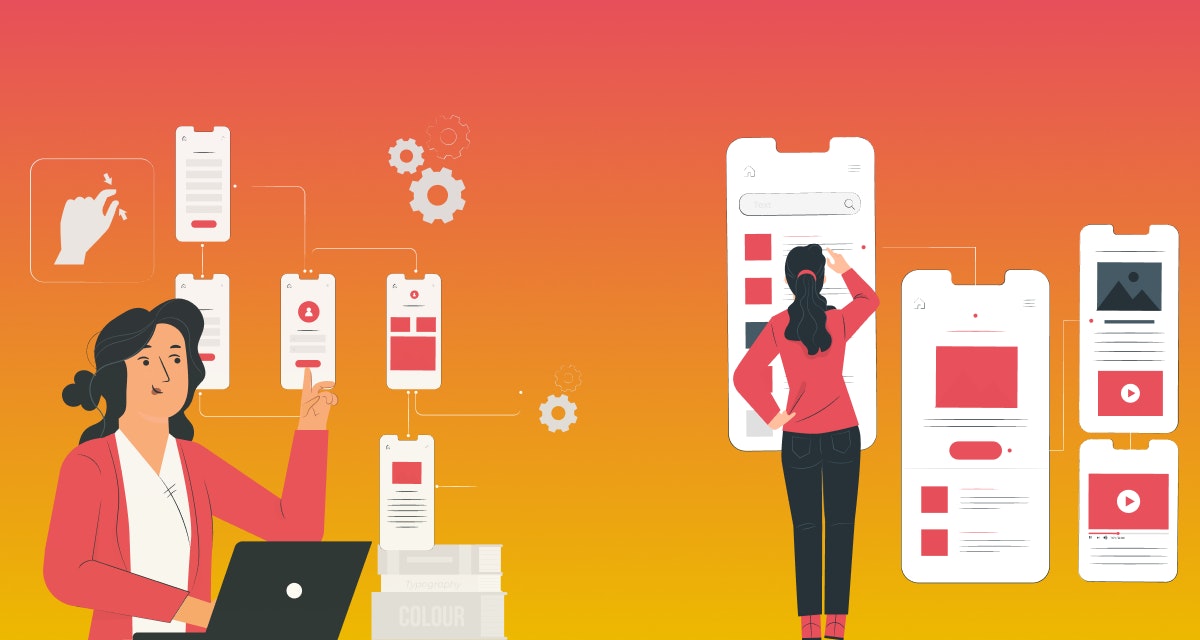
While targeting millennials as app users, you can’t compete by providing stereotype offerings. You have to include avant-garde features and functions in the Android and iOS app development and designing that would smoothen their lives. When it comes to mobile app design, they look for something smart, intuitive and interactive that is beyond their expectations. But, it’s no way too complex to understand and use.
The very next step user performs after launching the app is on boarding. It is a thorough guideline about how to operate an app. Keep the on boarding flow as smooth as possible to enable users to understand and use it easily.
Strategically designed on boarding flow facilitates users with efficient landing on the app that helps you in creating the first impression on user’s mind. Ultimately, ‘First Impression is the Last Impression’.
Rather than just offering an app, deliver lifetime value to the users so they won’t opt for another option. Start this practice with on boarding designing. Build strong relation with customers by creating engaging on boarding. Poor on boarding design creates negative impact on users and drives them towards app abandonment.
Don’t lose your customers! Design an amazing on boarding that insists them to take a complete walkthrough of your app. We are going unveils few on boarding design tips to keep your users educated, happy, and come back for more.
7 Tips for Mobile App On boarding Designing
1) Value Proposition Comes First
Your app definitely contains outstanding features. But few of them must be common. Highlight the core elements of the app, avoid showcasing generic one. Always remember, users are not interested to know what advanced features your app contain. They are excited to explore what benefits they can attain through those aspects. So, convey your value proposition to win the users for long term.
2) Unveil Core Functions
Emphasize to disclose key app functionalities along with value proportion. Obviously, app features and functions help users to understand the app and accomplish their desired tasks using highlighted buttons and callouts.
Don’t bombard all your app features on the users. Select few crux elements to educate users about the app. Introduce least important aspects while launching app upgrades in future. Else, you can also go with in-app messages to promote generic offerings.
3) Only Ask for Must-Have Permissions
These days almost every app asks for permission to access user’s data, photos, location and other personal details. Sometimes, the information is essential to deliver best values and experience to the users. But it happens that some apps ask for too many worthless access permissions that don’t have any connection with the app’s workflow. Such situations irritate the users and insist them to leave the app.
Be very precise while asking for permissions. Explain why does your app need to access certain data and information and how does it help in delivering extra value to the users.
4) Keep On boarding Simple and Upfront
Optimize user’s app on boarding experience by providing them essential information within selective screens. Don’t enforce users to swipe through dozen screens to get into the app! Try to put attractive app screenshots that involve creative illustrations and minimum text. Explains one feature per screen so users can have a clear understanding about each of exclusive offerings.
You can also integrate progress indicators in your app. It enables users to know if they are at the beginning, middle and end of the app on boarding.
5) Exclude Unnecessary Fat
Keep your on boarding as streamlined and quick as possible by eliminating obvious aspects of the app. For example; no need to mention the sharing icon as users are already familiar with it. They know very well how to operate it and how it works.
Similarly, users understand the icons of camera, email, liking, favouriting, etc. So, don’t waste the time of users and space of your on boarding process by describing common aspects of the app.
6) Quick and Easy Sign-up
One of the key barriers to app adoption. Keep your app’s sign-up process as simple, fast, and easy as you can. Allow users to sign-up with their existing social media accounts such as Google, Facebook, Twitter, etc. It not only facilitates them with smooth sign-up but also builds trust in their mind. Identify the most preferred sign-up platforms of users and facilitate them with all those options.
If you want, you can experiment with the sign-up timing. Few apps prefer to ask for sing-up at the end of on boarding, while others want users to sign-up immediately after launching the app even before the on boarding started.
7) CTA Is Must
Conclude your on boarding with effective call-to-action. Take your app users onward to access the app. Direct landing on the app, after completion of on boarding, increases their engagement and excitement.
Pick your preferred on boarding techniques from benefits oriented on boarding, function oriented on boarding, and progressive on boarding. But, apply all the above-described tips in on boarding screen designing to cater users with fantastic experience.
With the successful delivery of more than 1500 projects, Intuz holds deep insights about every aspect of mobile app development and designing. Our design artists experiment various trending designs and deliver appealing on boarding to deliver maximum value of your investment. You can also check out some app on boarding examples on our Dribbble page.
Image Source: Localytics


